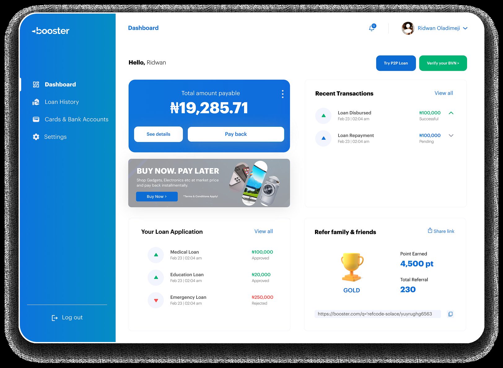
 Scroll ↓
A brand new web platform, designed from zero, giving Nigerians access to loans from multiple accredited providers in one place, with transparent terms and a frictionless application flow.
Scroll ↓Booster is a multi lending web platform that aggregates loan products from multiple accredited providers, letting people compare, apply and manage loans in a single dashboard. It was designed from scratch as a 0 to 1 product, with no existing design system or prior version to reference.
Lending in Nigeria is fragmented, opaque and deeply mistrusted. Users rarely know which provider to trust, what terms they are agreeing to, or what happens if something goes wrong. Booster was built to fix that with transparency, clear feedback and a genuine loan management experience.
Designing trust into a product that did not yet exist.
Building from zero meant solving product and UX problems at the same time. There was no legacy to work from, and no guardrails, so every decision had to be justified from first principles, especially given how sensitive loan management is for people.
Every offer shows amount, total payback, interest and terms up front, no hidden costs.
Every state, success, error, pending, is explained in warm, plain language rather than blocking alerts.
Every screen answers one question: does this make the user feel safer, or less?
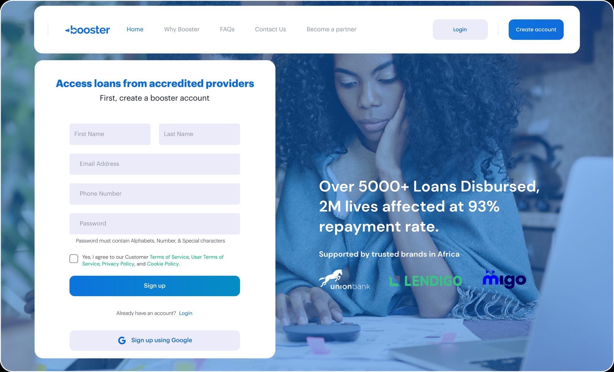
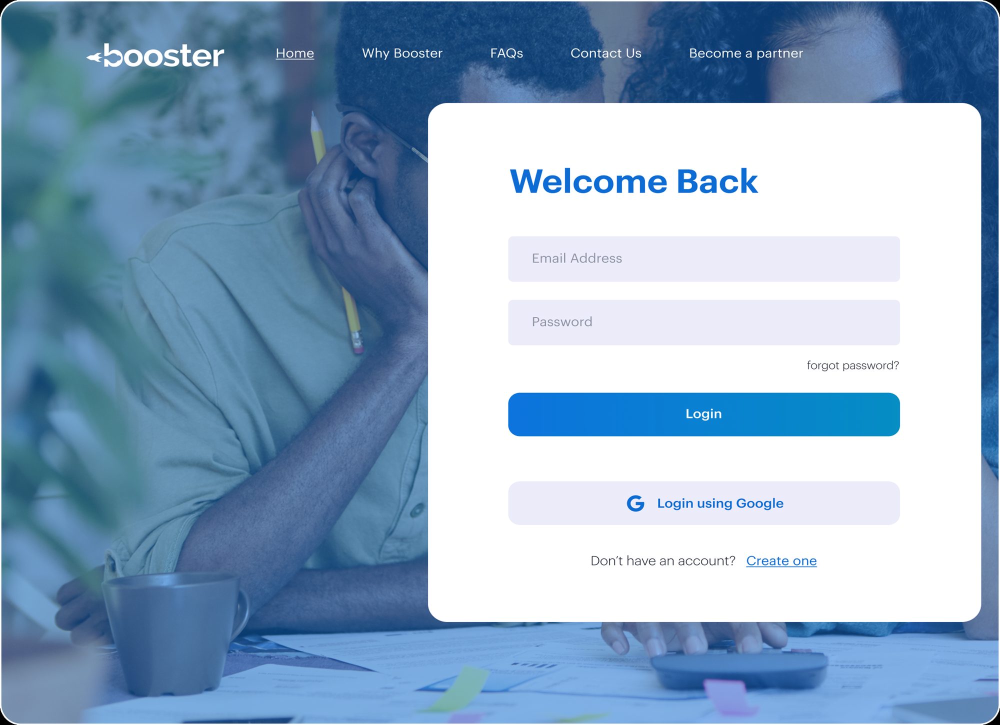
Sign up opens with an immediate value statement, access loans from accredited providers, no marketing fluff. Registration takes name, email, phone and password, or continue with Google, and the login mirrors it with a clean welcome back framing.
 Scroll ↓
 Scroll ↓
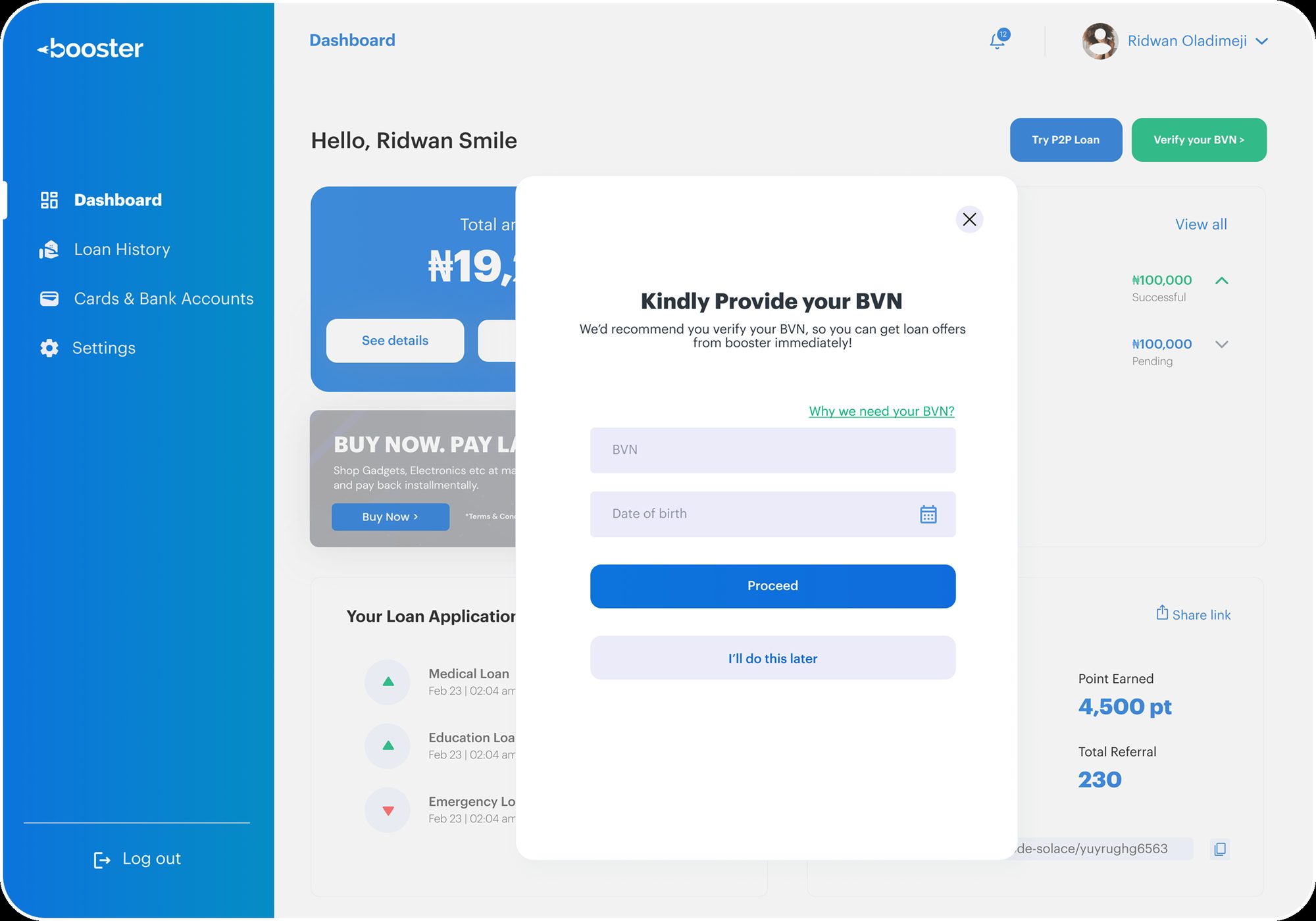
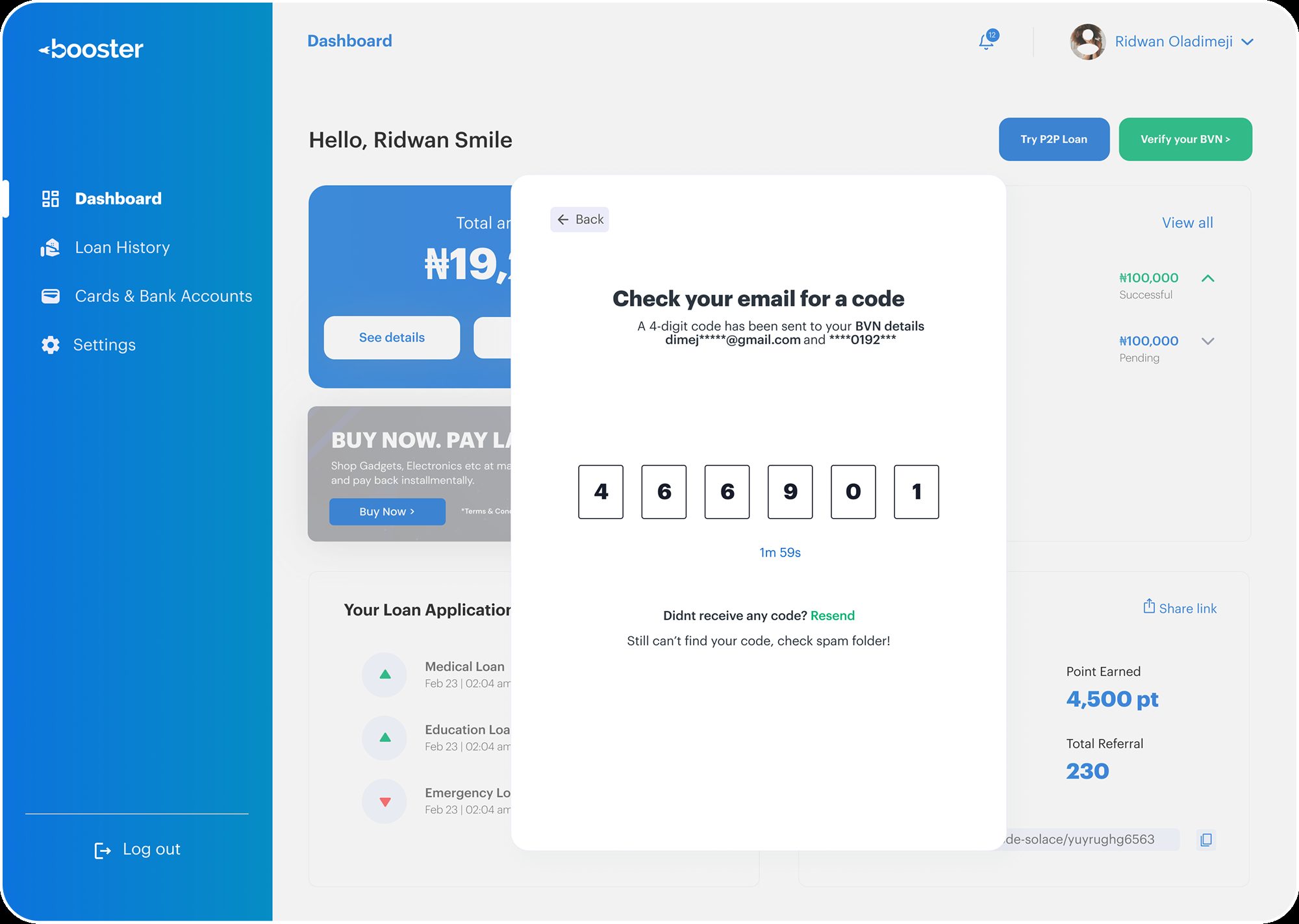
BVN verification was the most sensitive flow. Sharing government identity details triggers immediate suspicion in Nigeria's digital context, so the modal opens with a why we need your BVN link, an optional defer, and OTP entry. Failure states were designed with equal care: an invalid OTP shows a red inline error with resend or go back, and a failed request surfaces a warm amber warning rather than a blocking alert.
 Scroll ↓
 Scroll ↓
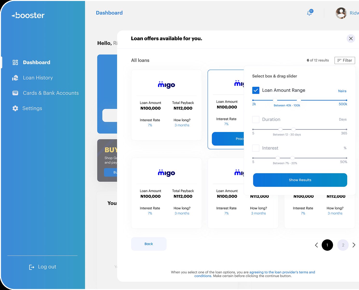
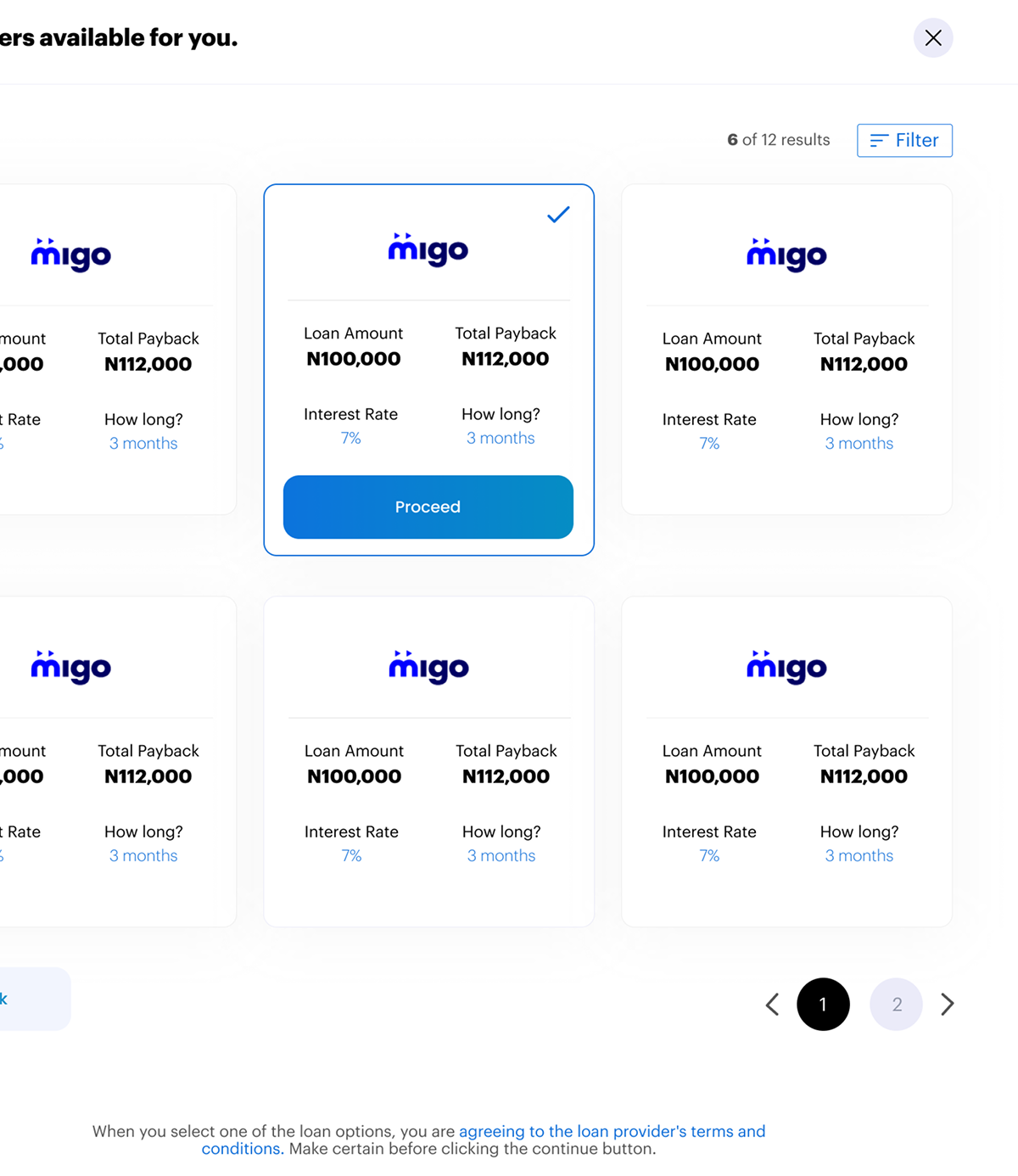
The application opens with a warm welcome that frames the first loan as a guided journey, not a form. Users enter an amount and reason, then see an offers grid with full transparency, loan amount, total payback and terms. Provider first cards build familiarity with accredited names, and an in context filter with range sliders keeps the comparison on one page.
 Scroll ↓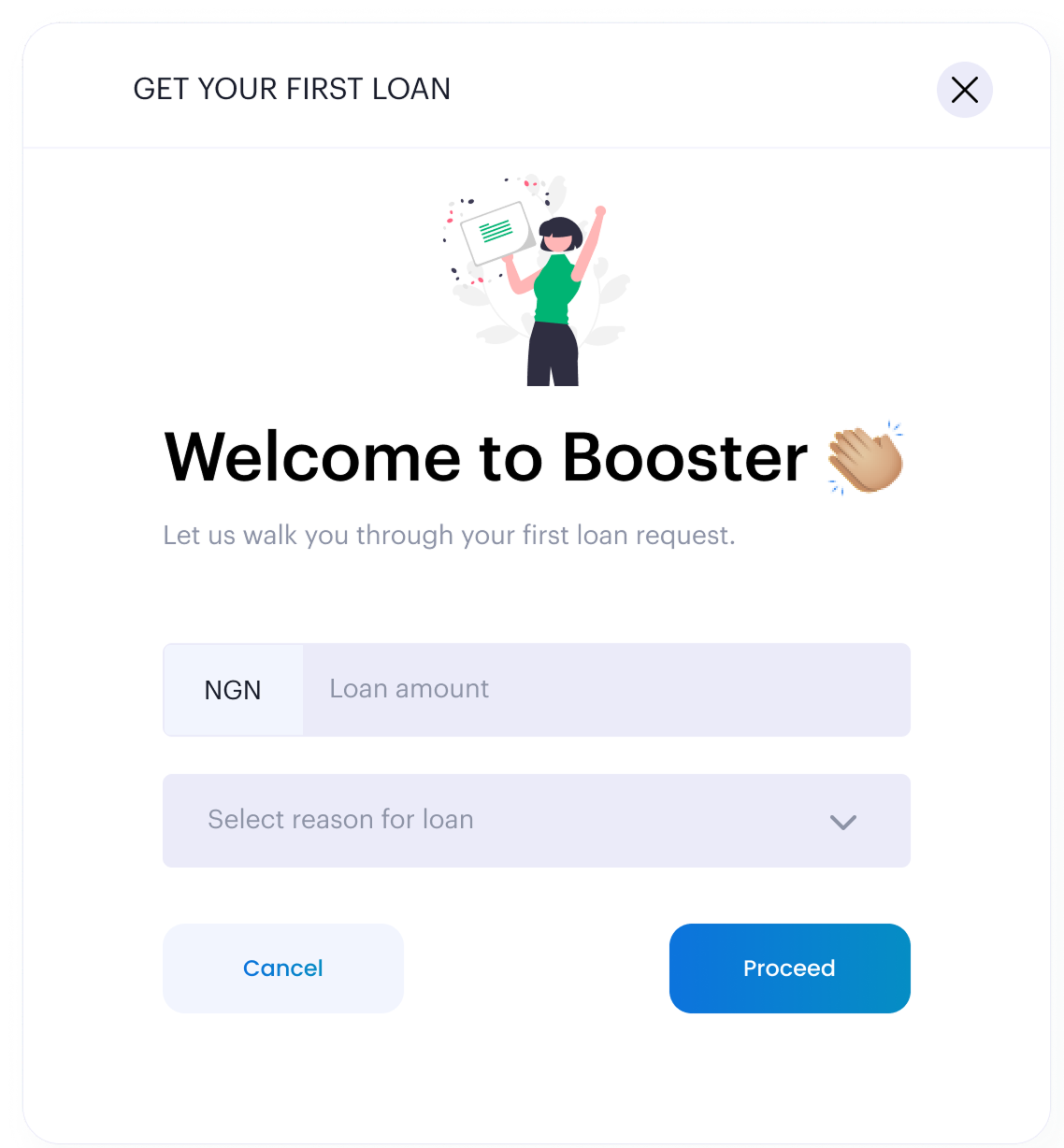
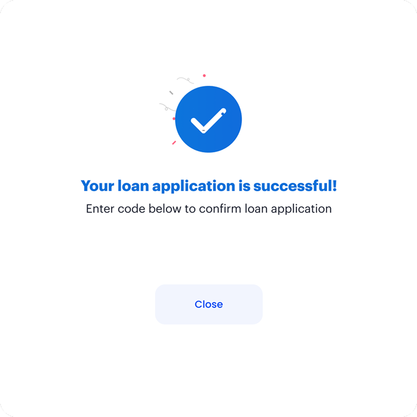
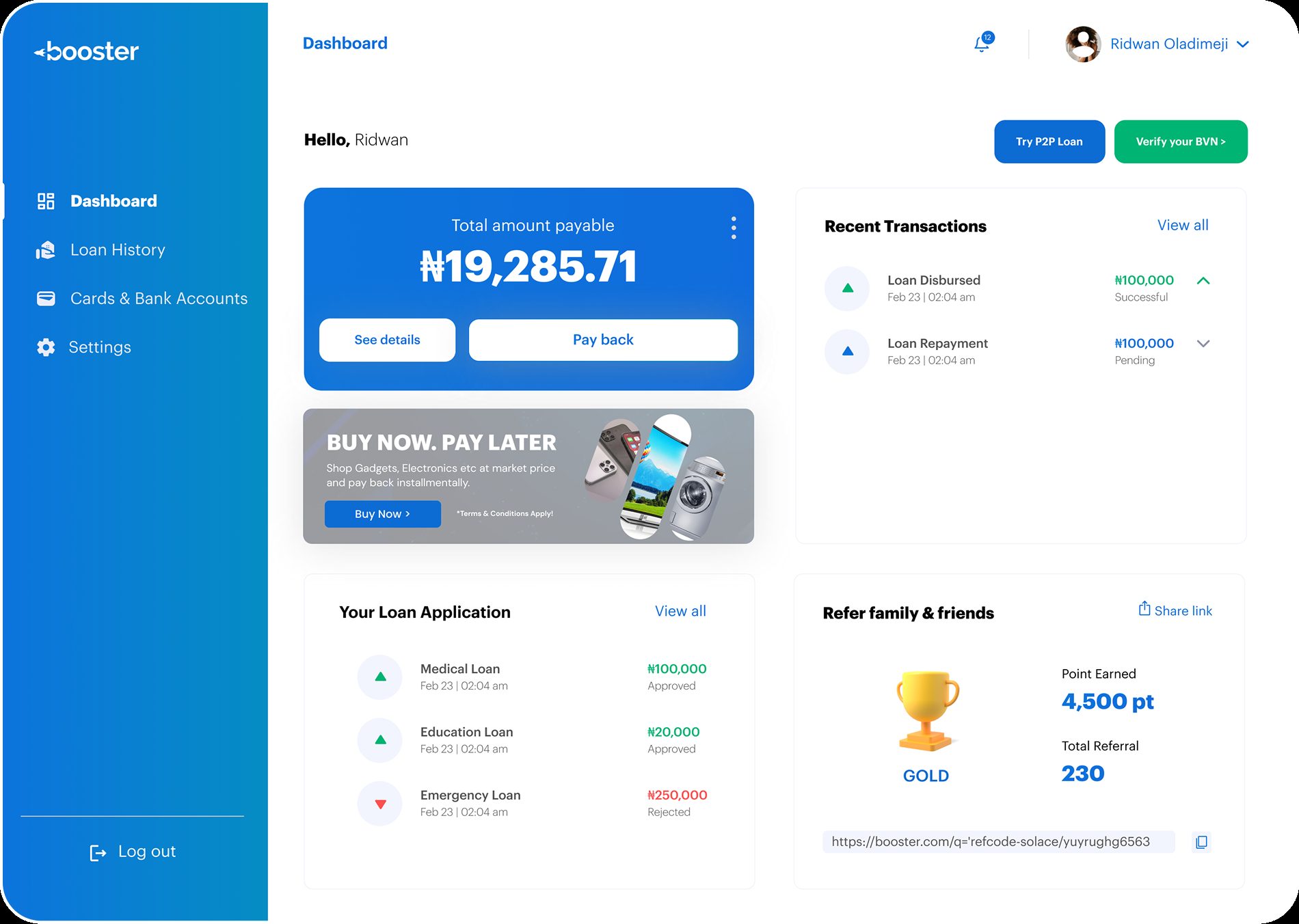
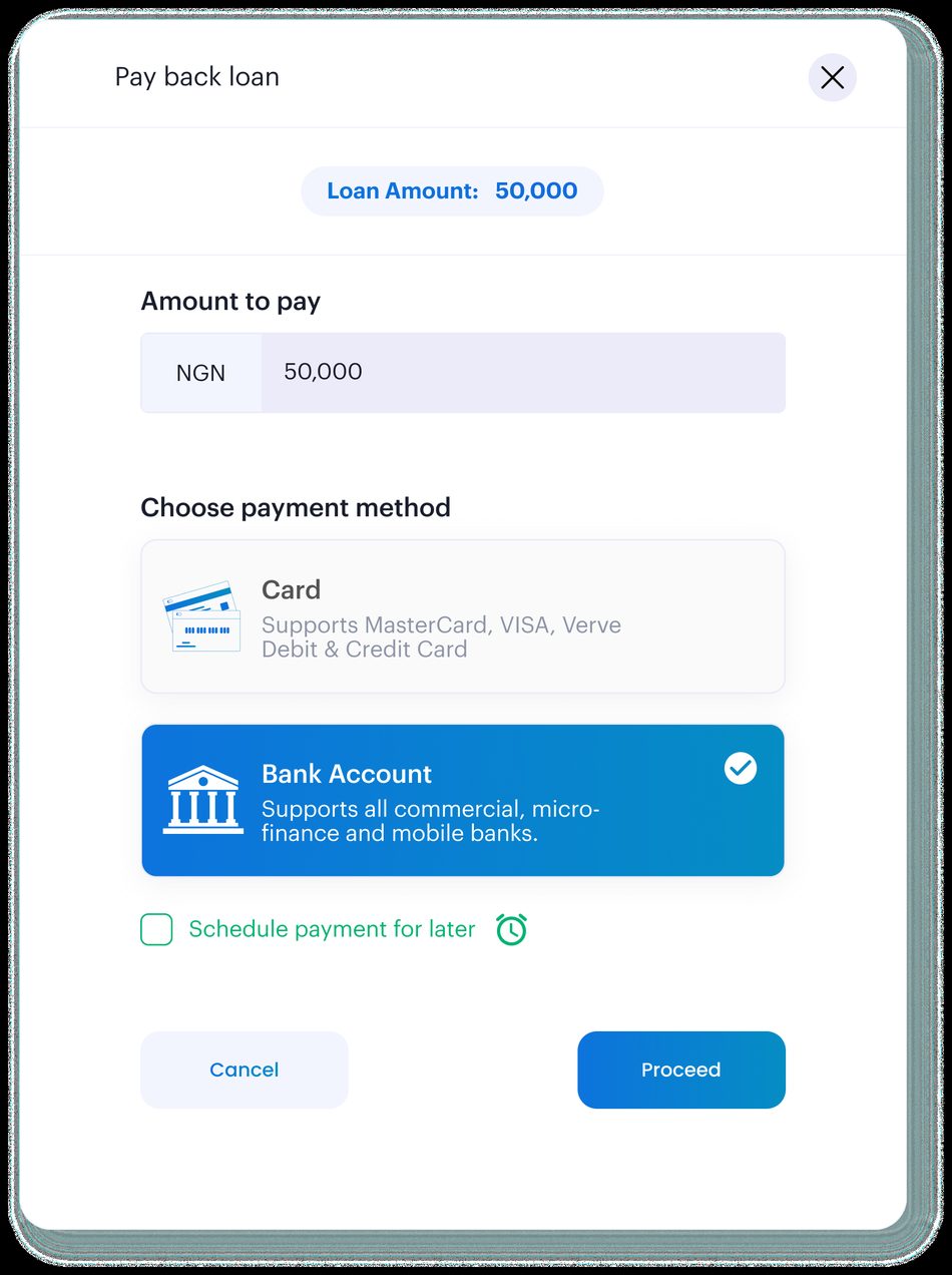
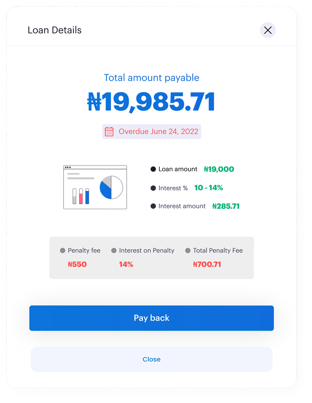
The pay back flow handles a high stakes moment, repaying real money. Users enter a custom amount defaulting to the full loan, choose card or bank account, and can optionally schedule a future payment with an inline date picker. The loan details view was designed for two states, active and overdue, with the overdue state adding a clear penalty breakdown.
 Scroll ↓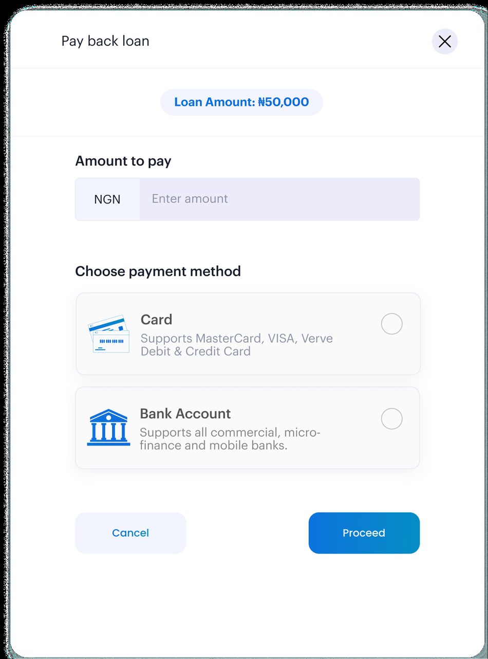
Lending UX in Nigeria has historically been built around the lender's needs, not the borrower's. Booster was a chance to flip that. Every screen had to answer, does this make the user feel safer, or less?
Booster went from zero to a fully designed, coherent lending platform, transparent by default and built to earn trust at every sensitive step.